Opt-in Pop-ups. You either love them or you really, really hate them.
And by love them, I, of course, mean you love how well they help to build your email list & promote your offers (no one really “loves” opt-in pop-ups… they are kind of like broccoli).
And by hate them I, of course, mean you can’t stand how obnoxious and pushy they can be.
And they can be really, really obnoxious.
Especially when they pop up straight away, take over the whole damn screen and are then impossible to close (or worse they pop up again just a few seconds later!!)
But they can also be really clever, beautiful and even engaging.
Yes, if you do them right (and I am going to tell you how to do them right in just a minute!), they can actually be a good thing for your readers, as well as your email list.
Sure, you’ll always get some rather unreasonable people who just seem to have a completely irrational hatred of opt-in pop-ups.
Almost like that pop up (which takes seconds to close btw) is somehow responsible for global warming, those extra 5kgs they put on last year, and that time the boy they liked in high-school, didn’t like them back.
You are never going to be able to please those people, but you also probably don’t want them on your list or in your community as they seem a little unbalanced and angry anyway, so when you weigh up the pros and cons I still think creating a “polite pop-up” and growing your email list by hundreds (if not thousands) each month is totally worth scaring off a few crazies in the process.
Don’t get me wrong, “back in the old days” of blogging, ALL opt-in pop-ups were annoying and probably also ugly (which is why I personally avoided using them for so long). So these pop-up haters are probably still a little scarred from that whole era.
But that was then when the plugins and technology available just wasn’t that smart. Or that affordable.
But today, wow, today we have access to so much crazy-smart nerdy things. Things that can make pop-ups almost a pleasure.
And it doesn’t cost a bomb either.
And yes, it’s still a damn-good (and almost unbeatable!) method for growing your email list.
So, how do you create an opt-in pop-up that people won’t hate?
Well here are my 5 rules of non-annoying pop-ups to help you grow your email list without pissing too many people off!
Rule #1 – Make it totally irresistible
Yes, you’ve all heard me bang on about how the key to a successful blog is knowing your readers wants and needs, and then helping them solve them, right?
Well, your pop-up is the perfect place to showcase this exact thing.
Pick the number one pain-point of your readers (that you can solve), and offer them a simple (and achievable) solution to that problem.
Maybe you have a challenge or a workbook or a free mini-online course.
Whatever it is, you need to make sure you are showcasing a solution or outcome that is so desirable to your readers that they’d even pay for it, but you are offering it to them for free.
This can take a little testing & tweaking to get spot-on, so don’t get discouraged if you don’t get it right first go.
And maybe make sure the opt-in pop-up plugin you are using has A/B or Split testing built in (so you can easily test multiple versions of your pop-up against each other to see which works the best).
I use Thrive Leads (US$60) and love it (and yes, it has split testing and all the other things I am going to mention below, all built in!)
How to create pop ups people don't hate Tip #1 - Make it so good they'd pay for it - but it's FREE Click To Tweet Rule #2 – Make it relevant
This is another bonus of just how smart the technology is these days. Because now you can actually create a couple of different pop-ups, each offering a solution to a slightly different problem, and then set your pop up to show the most relevant version to your readers based on the content they are reading.
So, if you are a food blogger for example, and you have pop-ups each offering different versions of a 14-day meal plan, you could show a “healthy / weight loss” based one to people reading your healthy recipes. Or a kid-friendly one to people reading kids recipes (just set the pop up to show via category to get this to work). Or a vegetarina one to people reading vegetarian recipes etc, etc…
Showing people an attractive solution or offer that’s relevant to them is going to always be more appreciated than one that is totally off the mark!
TIP: You don’t need to worry about having multiple pop ups straight away, this can be something you build on in time, so please don’t stress. Just focus on getting one amazing one up and running for now 🙂
Rule #3 – It’s all in the timing!
One of the main reasons people get annoyed by opt in pop ups is they are basically a digital version of a sales person pouncing on you the second you’ve walked into the store. Sure, they are just doing their job and trying to help, but you don’t need (or want) help yet!
You don’t even know if you like this store, or the products yet. And being pestered prematurely is not helping you make that decision.
In fact, it might just make you turn around and leave.
However, if you let someone browse for long enough, that it shows they clearly are interested in your content, THEN you can present them with this highly desirable thing (in a non-annoying way, which I’ll get to later).
Well, then you are not so much interrupting, as adding extra value. And because they already are liking you, they are probably less likely to get mad when you offer them this awesome free thing.
And the best thing is that it’s really easy to do this now days.
Most opt-in plugins (yes, including my beloved Thrive Leads) have the opt-ins to delay the pop up to only show once a person has either been on your site for a certain period of time, OR they have scrolled a certain percentage down the page.
Again this can take some testing & tweaking to find the perfect balance – I normally set mine for around 70% down the page, or after 40 seconds.
TIP: You can also set your opt-in pop-up to show on “exit intent” this means when someone moves their mouse to look like they are going to close the browser window and leave your blog. This is also another pretty safe place to put a pop up, as they are leaving anyway (so you’re not going to get in there way).
How to create pop ups people don't hate Tip #2 - Make it uncannily relevant to them!Click To Tweet How to create pop ups people don't hate Tip #3 - Don't interrupt... add value #secretbloggersbusinessClick To TweetRule #4 – A bit on the side
Now this is totally a personal preference thing, but personally I find that a pop-up that slides in down the bottom right-hand corner is just way less offensive and annoying than one that springs up right dead-centre and blocks what you were reading or doing.
Or worse, one of those damn page-take over things that seem so popular at the moment (so popular & annoying that Google is going to start penalising people for them!)
Sure it might convert slightly lower, but again, its less annoying (so you have to make the decision what is more important to you!).
How to create pop ups people don't hate Tip #4 - We all need a bit on the side #secretbloggersbusinessClick To TweetRule #5 – Mobile friendly = Google friendly
Now this one is so, sooo important.
Because the majority of traffic these days is from mobile phones. And yet so many pop-ups just don’t look great at all on mobile screen (even the ones that are supposedly mobile optimised).
And yes, as I mentioned already Google is going to actually start penalising people who have pop-ups or page takeovers that prevent people reading the content they were searching for (specifically for mobile traffic, read more about it here).
So, what can you do about it?
Well you could try to create a pop-up that looks kinda OK on both desktop and mobile.
OR, you can create two different versions one for mobile, and one for desktop, and have each look really, really amazing on their specific platform.
And because most opt-in pop-up builders these days come with lots of built in templates and options, that really isn’t too hard at all.
Plus any decent opt-in pop-up builder should also let you easily have different versions to show on different screens.

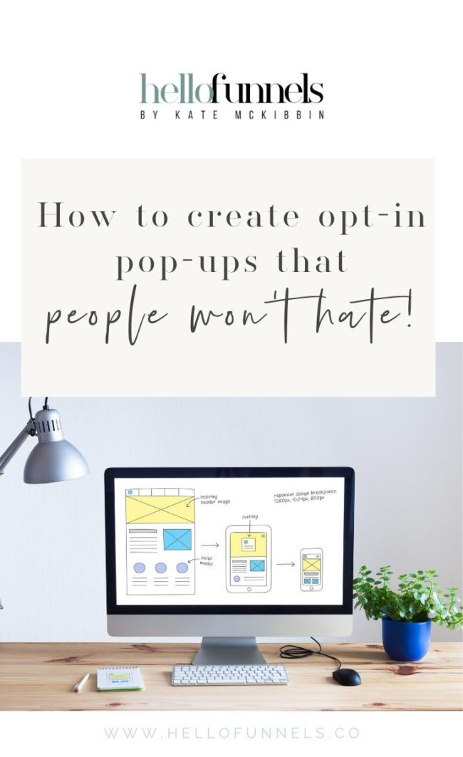
The recommendation for mobile pop-ups is something like the image above, so a panel at either the top or bottom of the screen that doesn’t take up more than 25% of the screen (and doesn’t get in the way of what people are reading!).
How to create pop ups people don't hate Tip #5 - Make it mobile & Google friendly #secretbloggersbusinessClick To TweetSo, there you have it guys. Just make-sure your pop ups follow the 5 rules for creating opt in pop ups that don’t piss people off, and then you can sit back and watch your email list grow (way more fun than watching grass grow I promise!).

Want to get started on your awesome opt in pop ups? Well here is a FREE, gorgeous and totally easy-to-customise Planner Download that you can now update and use as a content upgrade on your own blog.
Just click the link below for instant access!
Want to learn more of my tried & tested strategies for growing your email subscribers, and your blog? Come and join me for this FREE Blogging Workshop – Blog 2 Profit now by clicking here!


