
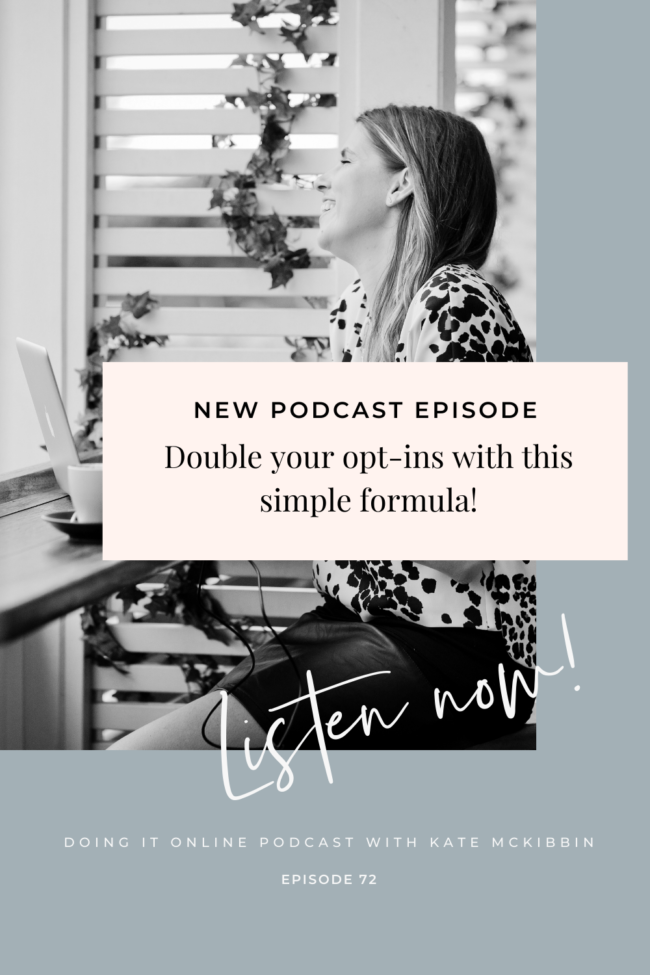
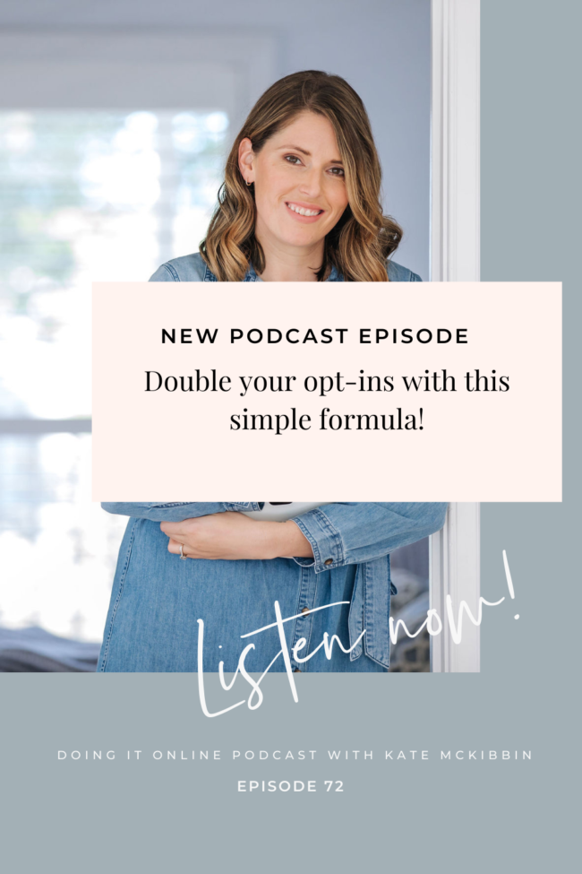
TUNE-IN: APPLE PODCASTS | SPOTIFY | GOOGLE PLAY
Things You’ll Learn in this Episode of Doing it Online:
- The 5 point simple but powerful formula that has our pages converting at 45% and higher!
- How to craft a killer headline for your opt-in page…
- Plus not 1 but 2 bonus tips!
One of our superpowers here at Hello Funnels is that we are really, really freaking good at creating high-converting lead magnet pages. Not just for us, but we loan our superpowers to our clients and to help them be freaking good at it as well.
The industry standard for a “good” converting opt-in page is usually 25%. But for our clients, we get them to aim (+ reach) 35% and above…and for our pages personally, we aim for 45% + higher…
And we usually get it. First go.
So how do we do it? What’s our magic formula?
I’ll walk you through it right now…
#1 Load times + mobile
So, first of all (+ this is SUPER important) your page needs to load quickly. And it MUST look good on mobile. Most people will be finding your page through social media and will most likely be coming to it from their phones… so the mobile version can’t be a watered down sample of your “real” page. It has to be the goods. And test it to make sure it has a MAX load time of 3 sec.
This is another reason why we love Showit by the way! They solve both of these problems really well.
#2 Keep it simple to start with…
Now the second part of our formula is that we are really big fans of keeping it simple. We don’t treat opt-in pages like mini sales pages, because they’re not…you shouldn’t actually have to sell too hard on your opt-in page at all.
If you think about how people stumble across these pages, it’s usually because they’ve seen an ad or a social media post and they’ve already decided they’re interested. They click through because they’re already super warm and ready to go. So if you make it crazy complicated for them and they can’t find the ‘GET IT NOW’ button…
…you’ll lose them. Because you’re actually just giving them the opportunity to talk themselves out of it and decide they don’t need it after all.
So just keep it simple.
Tip: In the episode go through a couple of troubleshooting ideas if you’re finding your page isn’t hitting the benchmarks, so give that a listen for the full scoop.
#3 Headline trifecta
The thing that will probably make the biggest difference to your conversions is your headline. And you’ve only got seconds to get their attention and stop them in their tracks…
So it needs to be killa. You want people to read it and go: “Hell yeah. Give me that thing.”
To do that, you want it to hit three things:
- WHO it’s for
- WHAT it is
- WHY it’s valuable.
You can’t afford to be vague here. You need to talk about the outcome and either what pain it’s going to stop in their lives or what awesome thing it’s going to add to their lives…
And if copy is just not your jam, this is one of the first things I’d recommend outsourcing. Copy is just one of those things that a lot of people find really hard. It’s one of the reasons why our copy call in our eCourse Empire program is one of our most popular calls!
If outsourcing isn’t on the cards right now, take your time with the headline and focus on hitting those three things and you’ll be close to nailing it.
#4 Productize it
Let’s see a picture of your freebie! Even if it’s digital! The chances are your opt-in isn’t going to be something tangible, but that doesn’t mean you can’t productize it. It just helps to show the value, and that they really are getting something for subscribing. If it’s a PDF you can take some screenshots and display them nicely, or use Canva to pop them into a blank ipad with a drop shadow.
#5 BFO button above the fold
Pardon my french but the last part of our formula is that you want to have a “Big Fuck Off” button above the fold.
It needs to be big (but not ridiculously large) and it needs to be in a contrasting colour to the rest of your page – not anything clashing or glaring on the eyes, just a colour that pops on the page. You want it to stand out and say ‘Hey, look at this!’ The last thing you want is people having to search for the button.
The wording on the button is important too. Make sure it feels action-y. (It’s our word.)
Bonus tip:
Add some social proof! Maybe one or two killer testimonials, or even some credibility markers will do the trick, and they can all just sit right at the fold, so they are still slightly visible before the scroll, but you see them in full once you scroll down.
Bonus, bonus tip:
Not a lot of people know to do this especially with their first lead magnet. Our bonus, bonus tip for you is to make sure there’s no other distractions or call to actions on the page! Remove the navigation and any other pop-ups here. We just want one action from people that land here, so don’t confuse that goal.
And that’s it! As always, I do go into more juicy detail in the episode itself, so go give that a listen, and make sure you let us know how you go!
")

 (13)")